Dabble’s New Desktop Features

This post originally appeared on Medium.com.
While working on mobile support for Dabble, I threw in an epic fantasy’s worth of new desktop features for you!
Don’t know what Dabble is? It is an online/offline tool for writing novels that helps you actually write better stories.
On to the good stuff.
Refreshed Design Elements
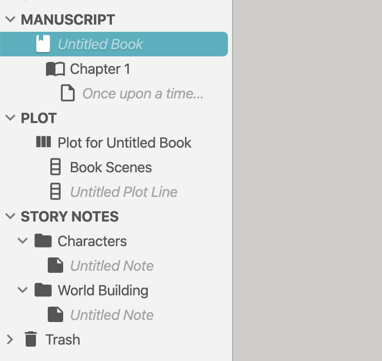
I’ve updated Dabble’s icons to be crisper, changed the font for the user interface (buttons, labels, etc) to use your operating system’s default, and adjusted section headings in the left-hand nav for easier scanning.
I’ve updated your preferences, profile, and billing to be easier to use, especially on touch devices.

I updated your billing area so you can see your current plan, next payment, and past invoices.

Adjustable Sidebars
I made some nice improvements to the sidebars for you.
- I allowed titles in the left-hand nav to use a little more room so the text doesn’t cut off as short.
- I made the left and right-hand sidebar width adjustable — larger or smaller — by clicking the edge and dragging. Double-click the edge to restore to default.
- When focus mode is on, the space those sidebars takes up is freed so the manuscript can have more room on smaller screens.
- Buttons at the bottom will collapse and restore sidebars. Screenshot in the next section.
Status Bar
I’ve create your very own extra special status bar at the bottom. You can find your selected document’s word counts easier and project save & sync status.

More Counts
You can see in this screenshot, you also have more counts. A page count is now included, which is the simple industry average calculation of 250 words per page. And when you select text, you will also get a count of the words selected appearing here.
Full Screen and Focus Toggle
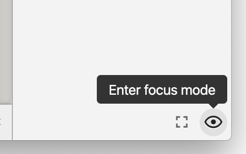
I made you two Quick Buttons in the bottom-right corner to toggle and disable focus mode and go in and out of full screen.
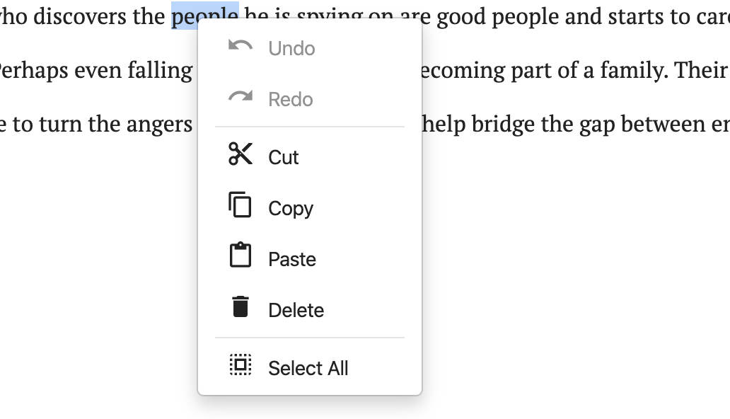
Right click? What’s that?
Sure, websites don’t often provide a right-click menu. But a good web app probably ought to. Now you can undo/redo from the right-click menu in addition to the keyboard shortcuts.
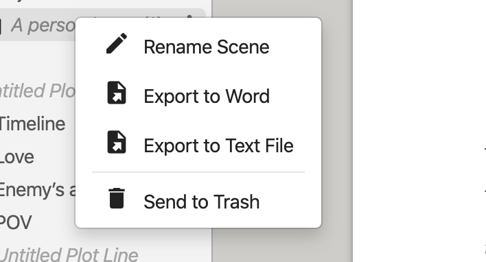
And the action menus in the navigation are easier to access via right-click.
Fonts and Formatting
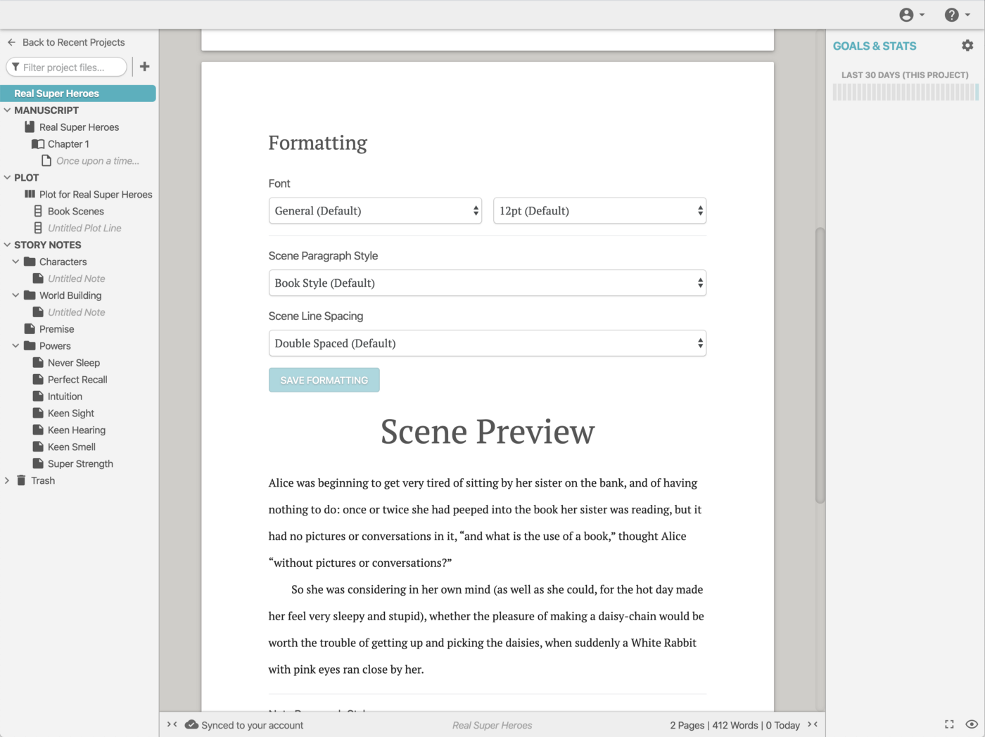
I wanted you to work with your manuscript and story notes in the way you feel most comfortable. Per-project. So at the top of the navigation, above MANUSCRIPT, is a project doc with project settings.
Project Naming
This project doc at the top of your nav also gives you power to name your project something different than your book’s title, allowing you to identify series or multiple versions of the same book better.
Auto Dark Theme
If your desktop or mobile OS switches to a dark theme automatically (e.g. in the evening), Dabble’s dark mode now switches with it! Automatically. Not bad for a web app, huh?
A New Quote Style
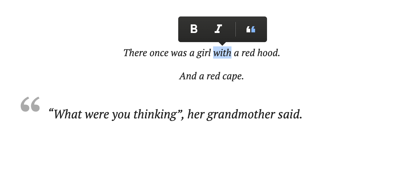
If you write poetry, or include poems, song lyrics, or short blurbs at the start of your chapters, you’re going to like this.
I’ve extended the quote format to 2 different styles instead of 1. The new style is centered and italicized, allowing you to do more.
Spread the Word
If any of this excites you, I could really use your help spreading the word about Dabble. Many still have not heard of Dabble, and most have not heard how you feel about it.


.jpeg)
